US County-level Unemployment

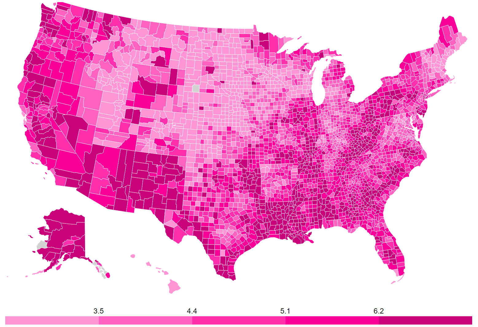
Unemployment data from 01-2024. That is the latest data available as of 04-18-2024.

  • 3.0
  • 3.6
  • 4.2
  • 5.1


This map shows the latest unemployment rate for each county in the United States. You can click on a county to view a graph (from FRED) of its unemployment rate over time. Click, zoom, or pan around the map to better understand the geographic differences in employment across the country. This map updates itself daily and will show the most recent data available. Note: county-level unemployment isn't seasonally adjusted.


Observations

A few observations as of 11-17-2016 (here is a screenshot of the map as I write this):

  • I was surprised by the high unemployment in Western Pennsylvania. Might this economic malaise have contributed to Trump's surprise victory in PA?
  • Appalachia really pops out as dark pink. Some regional (cross-state) factors seem to be driving unemployment.
  • In contrast, states can buck regional trends. Notice Arkansas, it is almost entirely light pink in a sea of high unemployment. Is this good governance. Wal-Mart money?
  • The Plain states (IA, NE, ND, SD) do better than I expected and the Southwest (CA, NV, AZ, NM) does worse. Is this driven by demographics or something else?

Sources

  • Data: US Bureau of Labor Statistics via the FRED API
  • Disclaimer: This product uses the FREDĀ® API but is not endorsed or certified by the Federal Reserve Bank of St. Louis
  • Map software: SimpleMaps county map
  • Heatmap procedure: See this heatmap tutorial

Interested in creating a map like this?

Hire us to create a map visualization for you. Or, DIY with our map library and tools .

Home | License | Privacy | Releases | Testimonials | Resources | Documentation | Order Lookup | All Maps | FAQs
Formerly FlashUSAmap.com and FlashWorldMap.com
SimpleMaps.com is a product of Pareto Software, LLC. © 2010-2024.