Our interactive map customization tool makes it easy to visualize state and country level statistics quickly and easily. To create your own interactive heat map, follow these steps:
Customize a map using our online tool.
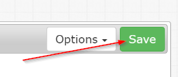
Click "Save" and bookmark the page so you can come back later.
Click on the "Data" tab.
Enter or paste the data values in for each state/country.
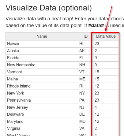
Tip: You can copy the data table, paste it into Excel, manipulate the data in Excel, and then paste the results back into the online spreadsheet when you are done.
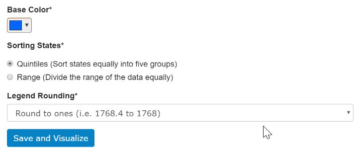
Choose the base color for the heat map as well as the settings for how you want observations sorted. These settings can always be changed later. Then click "Save and Visualize".
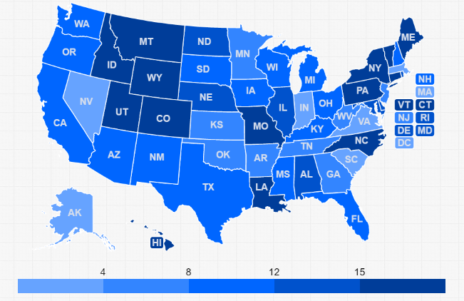
Your heat map will appear:
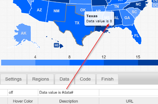
It is recommended that you set the state_hover_color: 'off'.
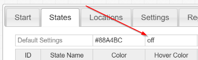
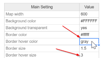
Instead use border_hover_color and border_hover_size to emphasize hovering.
This way, the user doesn't lose the information conveyed by the state's color, when he/she hovers over a state.
You can reference the data when you edit the state/country description. Simply use keyword #data# in the description ("States" tab) and resave your visualization ("Data" tab). All instances of #data# will be replaced with each state's data value.
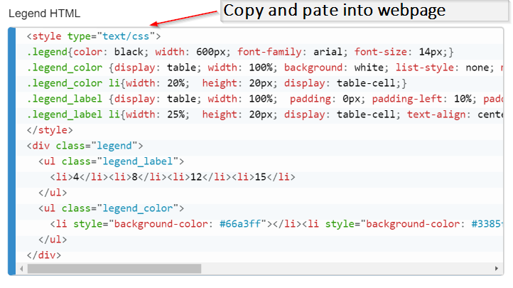
To get the map key, copy the legend from HTML from the "Data" tab.
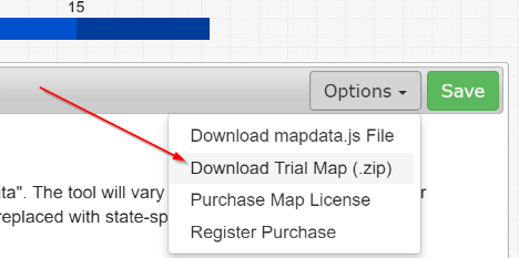
Download the map from the "Options" dropdown.
We've also put together a screencast to walk you through this process:
Home | License | Privacy | Releases | Testimonials | Resources | Documentation | Order Lookup | All Maps | FAQs
Popular Resources: Free SVG Maps | Free GIS Files | Free Cities Data | Zip Code Visualizations | Trauma Centers by State | Geography Quizzes
SimpleMaps.com is a product of Pareto Software, LLC. © 2010-2026.